How to Use Separators
JSeparator class provides a horizontal or vertical dividing line
or empty space.
It's most commonly used in menus and tool bars.
In fact, you can use separators
without even knowing that a JSeparator class exists,
since menus
and tool bars
provide convenience methods
that create and add separators
customized for their containers.
Separators are somewhat similar to
borders, except that they are genuine components
and, as such,
are drawn inside a container,
rather than around the edges of a particular component.
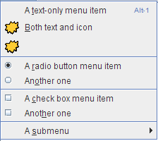
Here is a picture of a menu that has three separators, used to divide the menu into four groups of items:

The code to add the menu items and separators to the menu is extremely simple, boiling down to something like this:
menu.add(menuItem1);
menu.add(menuItem2);
menu.add(menuItem3);
menu.addSeparator();
menu.add(rbMenuItem1);
menu.add(rbMenuItem2);
menu.addSeparator();
menu.add(cbMenuItem1);
menu.add(cbMenuItem2);
menu.addSeparator();
menu.add(submenu);
Adding separators to a tool bar is similar.
You can find the full code explained in the
how-to sections for
menus
and tool bars.
If you want more control over separators in menus and tool bars,
you can directly use the
JSeparator subclasses that implement them:
JPopupMenu.Separator and
JToolBar.Separator.
In particular, JToolBar.Separator
has API for specifying the separator's size.
Using JSeparator
You can use the JSeparator class directly
to provide a dividing line in any container.
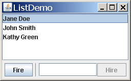
The following picture shows a GUI
that has a separator to the right of the button
labeled Fire.

Separators have almost no API and are extremely easy to use
as long as you keep one thing in mind:
In most implementations,
a vertical separator has a preferred height of 0,
and a horizontal separator has a preferred width of 0.
This means a separator
is not visible
unless you either set its preferred size
or put it in under the control of a layout manager
such as BorderLayout or BoxLayout
that stretches it to fill its available display area.
The vertical separator does have a bit of width (and the horizontal a bit of height), so you should see some space where the separator is. However, the actual dividing line isn't drawn unless the width and height are both non-zero.
The following code snippet
shows how ListDemo puts together
the panel that contains the vertical separator.
You can find the full source code for ListDemo in
ListDemo.java.
JPanel buttonPane = new JPanel();
buttonPane.setLayout(new BoxLayout(buttonPane,
                                   BoxLayout.LINE_AXIS));
buttonPane.add(fireButton);
buttonPane.add(Box.createHorizontalStrut(5));
buttonPane.add(new JSeparator(SwingConstants.VERTICAL));
buttonPane.add(Box.createHorizontalStrut(5));
buttonPane.add(employeeName);
buttonPane.add(hireButton);
buttonPane.setBorder(BorderFactory.createEmptyBorder(5,5,5,5));
JPanel instance
that uses a left-to-right
box layout.
Thanks to the layout manager
(and to the fact that separators have unlimited maximum sizes),
the separator is automatically made as tall
as its available display area.
In the preceding code, the horizontal struts are invisible components used to provide space around the separator. A 5-pixel empty border provides a cushion around the panel, and also serves to prevent the separator from extending all the way to the component above it and the window's edge below it.
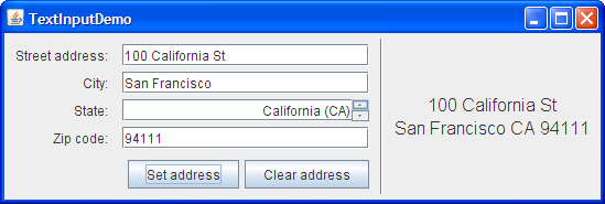
Here's a picture of another GUI that uses a separator, this time to put a dividing line between a group of controls and a display area.

You can find the code in the example index. Here is the code that sets up the separator's container:
JPanel panel = new JPanel(new BorderLayout());
...
panel.setBorder(BorderFactory.createEmptyBorder(
                        GAP/2, //top
                        0,     //left
                        GAP/2, //bottom
                        0));   //right
panel.add(new JSeparator(JSeparator.VERTICAL),
          BorderLayout.LINE_START);
panel.add(addressDisplay,
          BorderLayout.CENTER);
BorderLayout-controlled container
makes the separator as tall as the
address-display component
that's in the center of the container.
See
How to Use BorderLayout for details on how border layouts work.
The Separator API
The API for using separators is minimal, since they have no contents and don't respond to user input.
| Constructor or Method | Purpose |
|---|---|
|
void addSeparator() void addSeparator(Dimension) (in JToolBar)
|
Append a tool bar separator (which is invisible in most, if not all, look and feels) to the current end of the tool bar. The optional argument specifies the size of the separator. The no-argument version of this method uses a separator with a default size, as determined by the current look and feel. |
|
void addSeparator() void insertSeparator(int) (in JMenu)
|
Put a separator in the menu.
The addSeparator method
puts the separator at the current end of the menu.
The insertSeparator method
inserts the separator into the menu
at the specified position.
|
|
void addSeparator() (in JPopupMenu)
|
Put a separator at the current end of the popup menu. |
|
JSeparator() JSeparator(int) |
Create a separator.
If you don't specify an argument,
the separator is horizontal.
The argument can be either
SwingConstants.HORIZONTAL or
SwingConstants.VERTICAL.
|
|
void setOrientation(int) int getOrientation() (in JSeparator)
|
Get or set the separator's orientation,
which can be either
SwingConstants.HORIZONTAL or
SwingConstants.VERTICAL.
|
|
JToolBar.Separator() JToolBar.Separator(Dimension) |
Create a separator for use in a tool bar. The optional argument specifies the separator's size. |
|
setSeparatorSize(Dimension) (in JToolBar.Separator)
|
Specify the separator's size.
More specifically,
the specified Dimension
is used as the separator's minimum, preferred, and maximum sizes.
|
| JPopupMenu.Separator() | Create a separator for use in a menu. |
Examples that Use Separators
Several of this lesson's examples use separators, usually in menus. Here is a list of some of the more interesting examples.
| Example | Where Described | Notes |
|---|---|---|
ListDemo
|
This section and How to Use Lists | Uses a vertical separator in a panel controlled by a horizontal box layout. |
TextInputDemo
|
This section and How to Use Formatted Text Fields | Uses a vertical separator at the left of a panel controlled by a border layout. |
MenuDemo
|
This section and How to Use Menus | Uses the JMenu method addSeparator
to put separators in a menu.
|
ToolBarDemo2
|
How to Use Tool Bars | Uses the JToolBar method addSeparator
to put space
between two kinds of buttons.
|
