How to Use Color Choosers
JColorChooser class to enable users to choose from a palette of colors.
A color chooser is a component that you can place
anywhere within your program GUI.
The JColorChooser API also makes it easy
to bring up a dialog
(modal or not) that contains a color chooser.
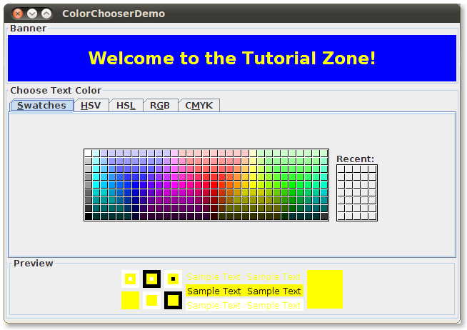
Here is a picture of an application that uses a color chooser to set the text color in a banner:
Try this:
- Click the Launch button to run the ColorChooser Demo using
Java™ Web Start (download the JDK).
Alternatively, to compile and run the example yourself,
consult the
example index.

Note:
The implementation of JColorChooser was enhanced in JDK 7. If you
run the example using JDK 6 or earlier, you will see a simpler color chooser
component.
ColorChooserDemo.java.
The color chooser consists of everything within the box labeled Choose Text Color. This is what a standard color chooser looks like in the Java Look & Feel. It contains two parts, a tabbed pane and a preview panel. The three tabs in the tabbed pane select chooser panels. The preview panel below the tabbed pane displays the currently selected color.
Here is the code from the example that creates
a JColorChooser instance
and adds it to a container:
public class ColorChooserDemo extends JPanel ... {
    public ColorChooserDemo() {
        super(new BorderLayout());
        banner = new JLabel("Welcome to the Tutorial Zone!",
                            JLabel.CENTER);
        banner.setForeground(Color.yellow);
        . . .
        tcc = new JColorChooser(banner.getForeground());
        . . .
        add(tcc, BorderLayout.PAGE_END);
    }
JColorChooser constructor in the previous code snippet
takes a Color argument,
which specifies the chooser's initially selected color.
If you do not specify the initial color,
then the color chooser displays
Color.white.
See the
Color API documentation for a list of color constants you can use.
A color chooser uses an instance of
ColorSelectionModel to contain and manage the current selection.
The color selection model fires a change event
whenever the user changes the color in the color chooser.
The example program registers a change listener with the
color selection model so that it can update the
banner at the top of the window.
The following code registers and implements the change listener:
tcc.getSelectionModel().addChangeListener(this);
. . .
public void stateChanged(ChangeEvent e) {
    Color newColor = tcc.getColor();
    banner.setForeground(newColor);
}
A basic color chooser,
like the one used in the example program,
is sufficient for many programs.
However,
the color chooser API allows you to customize a color chooser
by providing it with a preview panel of your own design,
by adding your own chooser panels to it, or
by removing existing chooser panels from the color chooser.
Additionally, the JColorChooser class provides two
methods that make it easy to use a color chooser within a dialog.
The rest of this section discusses these topics:
- Another Example: ColorChooserDemo2
- Showing a Color Chooser in a Dialog
- Removing or Replacing the Preview Panel
- Creating a Custom Chooser Panel
- The Color Chooser API
- Examples that Use Color Choosers
Another Example: ColorChooserDemo2
Now let's turn our attention to ColorChooserDemo2, a modified version of the previous demo program that uses more of theJColorChooser API.
Try this:
- Click the Launch button to run the ColorChooser Demo using
Java™ Web Start (download the JDK).
Alternatively, to compile and run the example yourself,
consult the
example index.
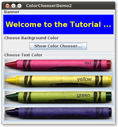
This program customizes the banner text color chooser in these ways:
- Removes the preview panel
- Removes all of the default chooser panels
- Adds a custom chooser panel
This program also adds a button that brings up
a color chooser in a dialog,
which you can use to set the banner background color.
Showing a Color Chooser in a Dialog
The JColorChooser class provides
two class methods to make it easy to use a color chooser in a
dialog.
ColorChooserDemo2 uses one of these methods,
showDialog,
to display the background color chooser when the user
clicks the Show Color Chooser... button.
Here is the single line of code from the example
that brings up the background color chooser in a dialog:
Color newColor = JColorChooser.showDialog(
                     ColorChooserDemo2.this,
                     "Choose Background Color",
                     banner.getBackground());
The dialog disappears under three conditions:
the user chooses a color and clicks the OK button,
the user cancels the operation with the Cancel button,
or the user dismisses the dialog with a frame control.
If the user chooses a color,
the showDialog method returns the new color.
If the user cancels the operation or dismisses the window,
the method returns null.
Here is the code from the example that updates
the banner background color
according to the value returned by showDialog:
if (newColor != null) {
    banner.setBackground(newColor);
}
showDialog is modal.
If you want a non-modal dialog,
you can use JColorChooser's
createDialog method to create the dialog.
This method also lets you specify action listeners for the
OK and Cancel
buttons in the dialog window.
Use JDialog's show method
to display the dialog created by this method.
For an example that uses this method, see
Specifying Other Editors
in the
How to Use Tables section.
Removing or Replacing the Preview Panel
By default, the color chooser displays a preview panel. ColorChooserDemo2 removes the text color chooser's preview panel with this line of code:tcc.setPreviewPanel(new JPanel());
JPanel has no size and no default view.
To set the preview panel back to the default,
use null as the argument to setPreviewPanel.
To provide a custom preview panel,
you also use setPreviewPanel.
The component you pass into the method should
inherit from JComponent,
specify a reasonable size,
and provide a customized view of the current color.
To get notified when the user changes the color
in the color chooser,
the preview panel must register
as a change listener on the color chooser's color selection model
as described previously.
Creating a Custom Chooser Panel
The default color chooser provides five chooser panels:
- Swatches — for choosing a color from a collection of swatches.
- HSV — for choosing a color using the Hue-Saturation-Value color representation. Prior to JDK 7, this was called HSB, for Hue-Saturation-Brightness.
- HSL — for choosing a color using the Hue-Saturation-Lightness color representation. This is new in JDK 7.
- RGB — for choosing a color using the Red-Green-Blue color model.
- CMYK — for choosing a color using the process color or four color model. This is new in JDK 7.
addChooserPanel,
or you can limit it by removing chooser panels
with removeChooserPanel.
If you want to remove all of the default chooser panels
and add one or more of your own, you can do this with a single
call to setChooserPanels.
ColorChooserDemo2
uses this method to replace the default chooser panels
with an instance of
CrayonPanel,
a custom chooser panel.
Here is the call to setChooserPanels from
that example:
//Override the chooser panels with our own.
AbstractColorChooserPanel panels[] = { new CrayonPanel() };
tcc.setChooserPanels(panels);
CrayonPanel.
Next the code calls setChooserPanels to
set the contents of the array as the color chooser's
chooser panels.
CrayonPanel is a subclass of
AbstractColorChooserPanel and overrides the five abstract methods defined in its superclass:
-
void buildChooser() - Creates the GUI that comprises the chooser panel. The example creates four toggle buttons — one for each crayon — and adds them to the chooser panel.
-
void updateChooser() - This method is called whenever the chooser panel is displayed.
The implementation of this method selects
the toggle button that represents the currently
selected color.
public void updateChooser() { Color color = getColorFromModel(); if (Color.red.equals(color)) { redCrayon.setSelected(true); } else if (Color.yellow.equals(color)) { yellowCrayon.setSelected(true); } else if (Color.green.equals(color)) { greenCrayon.setSelected(true); } else if (Color.blue.equals(color)) { blueCrayon.setSelected(true); } } -
String getDisplayName() - Returns the display name of the chooser panel.
The name is used on the tab for the chooser panel.
Here is the example
getDisplayNamemethod:public String getDisplayName() { return "Crayons"; } -
Icon getSmallDisplayIcon() - Returns a small icon to represent this chooser panel.
This is currently unused.
Future versions of the color chooser might use this icon
or the large one to represent this chooser panel in the display.
The example implementation of this method returns
null. -
Icon getLargeDisplayIcon() - Returns a large icon to represent this chooser panel.
This is currently unused.
Future versions of the color chooser might use this icon
or the small one to represent this chooser panel in the display.
The example implementation of this method returns
null.
The Color Chooser API
The following tables list the commonly usedJColorChooser constructors and methods.
Other methods you might call
are listed in the API tables in
The JComponent Class.
The API for using color choosers falls into these categories:
- Creating and Displaying the Color Chooser
- Customizing the Color Chooser GUI
- Setting or Getting the Current Color
| Method or Constructor | Purpose |
|---|---|
|
JColorChooser() JColorChooser(Color) JColorChooser(ColorSelectionModel) |
Create a color chooser.
The default constructor creates a color chooser
with an initial color of Color.white.
Use the second constructor
to specify a different initial color.
The ColorSelectionModel argument, when present,
provides the color chooser with a color selection model.
|
| Color showDialog(Component, String, Color) | Create and show a color chooser in a modal dialog.
The Component argument is the parent of the dialog,
the String argument specifies the dialog title,
and the Color argument specifies the chooser's initial color.
|
|
JDialog createDialog(Component, String, boolean, JColorChooser, ActionListener, ActionListener) |
Create a dialog for the specified color chooser.
As with showDialog,
the Component argument is the parent of the dialog and
the String argument specifies the dialog title.
The other arguments are as follows:
the boolean specifies whether the dialog is modal,
the JColorChooser is the color chooser to display
in the dialog,
the first ActionListener is for the OK
button, and the second is for the Cancel button.
|
| Method | Purpose |
|---|---|
|
void setPreviewPanel(JComponent) JComponent getPreviewPanel() |
Set or get the component used to preview the color selection.
To remove the preview panel, use new JPanel() as
an argument.
To specify the default preview panel, use null.
|
|
void setChooserPanels(AbstractColorChooserPanel[]) AbstractColorChooserPanel[] getChooserPanels() |
Set or get the chooser panels in the color chooser. |
|
void addChooserPanel(AbstractColorChooserPanel) AbstractColorChooserPanel removeChooserPanel(AbstractColorChooserPanel) |
Add a chooser panel to the color chooser or remove a chooser panel from it. |
|
void setDragEnabled(boolean) boolean getDragEnabled() |
Set or get the dragEnabled property, which must be true
to enable drag handling on this component. The default value is false.
See
Drag and Drop and Data Transfer for more details.
|
| Method | Purpose |
|---|---|
|
void setColor(Color) void setColor(int, int, int) void setColor(int) Color getColor() |
Set or get the currently selected color.
The three integer version of the setColor method
interprets the three integers together as an RGB color.
The single integer version of the setColor method
divides the integer into four 8-bit bytes and interprets the integer
as an RGB color as follows:
|
|
void setSelectionModel(ColorSelectionModel) ColorSelectionModel getSelectionModel() |
Set or get the selection model for the color chooser. This object contains the current selection and fires change events to registered listeners whenever the selection changes. |
Examples that Use Color Choosers
This table shows the examples that useJColorChooser
and where those examples are described.
| Example | Where Described | Notes |
|---|---|---|
| ColorChooserDemo | This section | Uses a standard color chooser. |
| ColorChooserDemo2 | This section | Uses one customized color chooser
and one standard color chooser in a dialog
created with showDialog.
|
| TableDialogEditDemo | How to Use Tables | Shows how to use a color chooser
as a custom cell editor in a table.
The color chooser used by this example is created
with createDialog.
|
| BasicDnD | Introduction to DnD | Uses a color chooser that is not in a dialog; demonstrates default drag-and-drop capabilities of Swing components, including color choosers. |
