How to Use Labels
JLabel class,
you can display unselectable text and images.
If you need to create a component
that displays a string, an image, or both,
you can do so by using or extending JLabel.
If the component is interactive and has a certain state,
use a
button
instead of a label.
By specifying HTML code in a label's text,
you can give the label various characteristics such as
multiple lines, multiple fonts or
multiple colors.
If the label uses just a single color or font,
you can avoid the overhead of HTML processing by using
the setForeground or setFont method instead.
See
Using HTML in Swing Components
for details.
Note that labels are not opaque by default. If you need to paint the label's background, it is recommended that you turn its opacity property to "true". The following code snippet shows how to do this.
label.setOpaque(true);
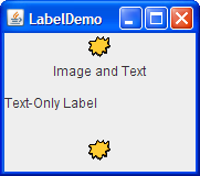
The following picture introduces an application that displays three labels. The window is divided into three rows of equal height; the label in each row is as wide as possible.
Try this:
- Click the Launch button to run the Label Demo using
Java™ Web Start
(download JDK 6).
Alternatively, to compile and run the example yourself,
consult the
example index.

- Resize the window so you can see
how the labels' contents are placed
within the labels' drawing area.
All the label contents have default vertical alignment — that is, the label contents are centered vertically in the label's drawing area. The top label, which contains both an image and text, has horizontal center alignment. The second label, which contains just text, has left (leading) alignment, which is the default for text-only labels in left-to-right languages. The third label, which contains just an image, has horizontal center alignment, which is the default for image-only labels.
Below is the code from
LabelDemo.java
that creates the labels in the previous example.
ImageIcon icon = createImageIcon("images/middle.gif");
. . .
label1 = new JLabel("Image and Text",
                    icon,
                    JLabel.CENTER);
//Set the position of the text, relative to the icon:
label1.setVerticalTextPosition(JLabel.BOTTOM);
label1.setHorizontalTextPosition(JLabel.CENTER);

label2 = new JLabel("Text-Only Label");
label3 = new JLabel(icon);
createImageIcon method
is similar to that used throughout this tutorial.
You can find it in
How to Use Icons.
Often, a label describes another component.
When this occurs,
you can improve your program's accessibility
by using the setLabelFor method
to identify the component that the label describes.
For example:
amountLabel.setLabelFor(amountField);
FormattedTextFieldDemo example
discussed in
How to Use Formatted Text Fields,
lets assistive technologies know
that the label (amountLabel)
provides information about the formatted text field (amountField).
For more information about assistive technologies, see
How to Support Assistive Technologies.
The Label API
The following tables list the commonly usedJLabel constructors and methods.
Other methods you are likely to call
are defined by the
Component
and
JComponent classes.
They include setFont,
setForeground,
setBorder,
setOpaque, and
setBackground.
See The JComponent Class
for details.
The API for using labels falls into three categories:
Note: In the following API, do not confuse label alignment with X and Y alignment. X and Y alignment are used by layout managers and can affect the way any component — not just a label — is sized or positioned. Label alignment, on the other hand, has no effect on a label's size or position. Label alignment simply determines where, inside the label's painting area, the label's contents are positioned. Typically, the label's painting area is exactly the size needed to paint on the label and thus label alignment is irrelevant. For more information about X and Y alignment, see How to Use BoxLayout.
| Method or Constructor | Purpose |
|---|---|
|
JLabel(Icon) JLabel(Icon, int) JLabel(String) JLabel(String, Icon, int) JLabel(String, int) JLabel() |
Creates a JLabel instance,
initializing it to have the specified text/image/alignment.
The int argument
specifies the horizontal alignment
of the label's contents within its drawing area.
The horizontal alignment must be one of the following constants
defined in the
SwingConstants interface (which JLabel implements):
LEFT, CENTER, RIGHT,
LEADING, or TRAILING.
For ease of localization,
we strongly recommend using
LEADING and TRAILING,
rather than LEFT and RIGHT.
|
|
void setText(String) String getText() |
Sets or gets the text displayed by the label. You can use HTML tags to format the text, as described in Using HTML in Swing Components. |
|
void setIcon(Icon) Icon getIcon() |
Sets or gets the image displayed by the label. |
|
void setDisplayedMnemonic(char) char getDisplayedMnemonic() |
Sets or gets the letter
that should look like a keyboard alternative.
This is helpful when a label describes a
component (such as a text field)
that has a keyboard alternative
but cannot display it.
If the labelFor property is also set
(using setLabelFor),
then when the user activates the mnemonic,
the keyboard focus is transferred to the
component specified by the labelFor property.
|
|
void setDisplayedMnemonicIndex(int) int getDisplayedMnemonicIndex() |
Sets or gets a hint as to which character in the text should be decorated
to represent the mnemonic. This is useful when you have two instances
of the same character and wish to decorate the second instance.
For example, setDisplayedMnemonicIndex(5)
decorates the character that is at position 5
(that is, the 6th character in the text).
Not all types of look and feel may support this feature.
|
|
void setDisabledIcon(Icon) Icon getDisabledIcon() |
Sets or gets the image displayed by the label when it is disabled. If you do not specify a disabled image, then the look and feel creates one by manipulating the default image. |
| Method | Purpose |
|---|---|
|
void setHorizontalAlignment(int) void setVerticalAlignment(int) int getHorizontalAlignment() int getVerticalAlignment() |
Sets or gets the area on the label where its contents should be placed.
The
SwingConstants interface defines five possible values for horizontal alignment:
LEFT,
CENTER (the default for image-only labels),
RIGHT,
LEADING (the default for text-only labels),
TRAILING.
For vertical alignment:
TOP,
CENTER (the default), and
BOTTOM.
|
|
void setHorizontalTextPosition(int) void setVerticalTextPosition(int) int getHorizontalTextPosition() int getVerticalTextPosition() |
Sets or gets the location where the label's text will be placed,
relative to the label's image.
The
SwingConstants interface defines five possible values
for horizontal position:
LEADING,
LEFT,
CENTER,
RIGHT, and
TRAILING (the default).
For vertical position:
TOP,
CENTER (the default), and
BOTTOM.
|
|
void setIconTextGap(int) int getIconTextGap() |
Sets or gets the number of pixels between the label's text and its image. |
| Method | Purpose |
|---|---|
|
void setLabelFor(Component) Component getLabelFor() |
Sets or gets which component the label describes. |
Examples That Use Labels
The following table lists some of the many examples that use labels.
| Example | Where Described | Notes |
|---|---|---|
LabelDemo
|
This section | Shows how to specify horizontal and vertical alignment as well as how to align a label's text and image. |
HtmlDemo
|
Using HTML in Swing Components | Lets you experiment with specifying HTML text for a label. |
BoxAlignmentDemo
|
Fixing Alignment Problems | Demonstrates possible alignment problems when using a label in a vertical box layout. Shows how to solve the problem. |
DialogDemo
|
How to Use Dialogs | Uses a changeable label to display instructions and provide feedback. |
SplitPaneDemo
|
How to Use Split Panes and How to Use Lists | Displays an image using a label inside of a scroll pane. |
SliderDemo2
|
How to Use Sliders | Uses JLabel to provide labels for a slider.
|
TableDialogEditDemo
|
How to Use Tables | Implements a label subclass,
ColorRenderer,
to display colors in table cells.
|
FormattedTextFieldDemo
|
How to Use Formatted Text Fields | Has four rows, each containing a label and the formatted text field it describes. |
TextComponentDemo
|
Text Component Features | TextComponentDemo has an inner class
(CaretListenerLabel)
that extends JLabel
to provide a label that listens for events,
updating itself based on the events.
|
ColorChooserDemo
|
How to Use Color Choosers | Uses an opaque label to display the currently chosen color against a fixed-color background. |
