Home Page
>
Graphical User Interfaces
>
Swing Features
A Visual Guide to Swing Components (Windows Look and Feel)
This page shows Swing components in the Windows look and feel.
The previous page shows the same components in the
Java look and feel.
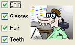
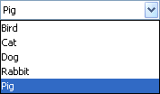
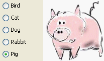
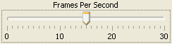
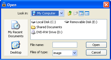
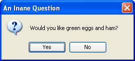
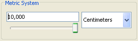
Basic Controls
Simple components that are used primarily to get input from the user;
they may also show simple state.
|
|
|
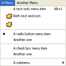
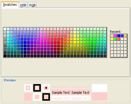
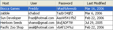
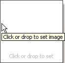
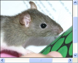
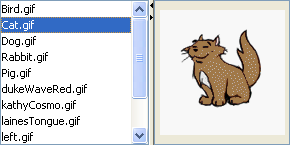
Interactive Displays of Highly
Formatted Information
These components display highly formatted information that
(if you choose) can be modified by the user.
|
|
|
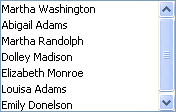
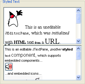
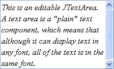
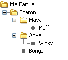
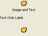
Uneditable Information Displays
These components exist solely to give the user information.
|
|
|
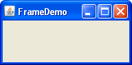
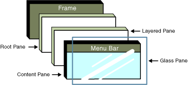
Top-Level Containers
At least one of these components must be present in any Swing
application.
|
|
|
General-Purpose Containers
These general-purpose containers are used in most Swing applications.
|
|
|
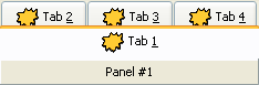
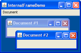
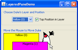
Special-Purpose Containers
These special-purpose containers play specific roles in the UI.
|
|
|

