Feedback Form
|
|
Start of Tutorial > Start of Trail > Start of Lesson |
Search
Feedback Form |
You might be wondering what exactly assistive technologies are, and why you should care. Primarily, assistive technologies exist to enable people with permanent or temporary disabilities to use the computer. For example, if you get carpal tunnel syndrome, you can use assistive technologies to accomplish your work without using your hands.Assistive technologies—voice interfaces, screen readers, alternate input devices, and so on—are useful not only for people with disabilities, but also for people using computers in non-office environments. For example, if you're stuck in a traffic jam, you might use assistive technologies to check your email, using only voice input and output. The information that enables assistive technologies can be used for other tools, as well, such as automated GUI testers and input devices such as touchscreens. Assistive technologies get information from components using the Accessibility API, which is defined in the
javax.accessibilitypackage.
Because support for the Accessibility API is built into the Swing components, your Swing program will probably work just fine with assistive technologies, even if you do nothing special. For example, assistive technologies can automatically get the text information that is set by the following lines of code:
Assistive technologies can also grab the tool-tip text (if any) associated with a component and use it to describe the component to the user.JButton button = new JButton("I'm a Swing button!"); label = new JLabel(labelPrefix + "0 "); label.setText(labelPrefix + numClicks); JFrame frame = new JFrame("SwingApplication");Making your program function smoothly with assistive technologies is easy to do and, in the United States, may be required by federal law. For more information see Global Legal Resources for IT Related Accessibility Issues
.
The rest of this section covers these topics:
Here are a few things you can do to make your program work as well as possible with assistive technologies:
- If a component doesn't display a short string (which serves as its default name), specify a name with the
setAccessibleNamemethod. You might want to do this for image-only buttons, panels that provide logical groupings, text areas, and so on.
- Set tool tip
text for components whenever it makes sense to do so. For example:
aJComponent.setToolTipText(
     "Clicking this component causes XYZ to happen.");
- If you don't want to provide a tool tip for a component, use the
setAccessibleDescriptionmethod to provide a description that assistive technologies can give the user. For example:aJComponent.getAccessibleContext(). setAccessibleDescription( "Clicking this component causes XYZ to happen.");
- Specify keyboard alternatives wherever possible. Make sure you can use your program with only the keyboard. Try hiding your mouse! Note that if the focus is in an editable text component, you can use Shift-Tab to move focus to the next component.
Support for keyboard alternatives varies by component. Buttons
setMnemonicmethod. Menus inherit the button mnemonic support and also support accelerators, as described in Enabling Keyboard Operation
- Assign a textual description to all
ImageIconobjects in your program. You can set this property by using either thesetDescriptionmethod or one of theStringforms of theImageIconconstructors.
- If a bunch of components form a logical group, try to put them into one container. For example, use a
JPanel
- Whenever you have a label
setLabelFormethod so that assistive technologies can find the component that the label is associated with. This is especially important when the label displays a mnemonic for another component (such as a text field).
- If you create a custom component, make sure it supports accessibility. In particular, be aware that subclasses of
JComponentare not automatically accessible. Custom components that are descendants of other Swing components should override inherited accessibility information as necessary. For more information, see Concepts: How Accessibility Works and Making Custom Components Accessible.
- Use the examples provided with the accessibility utilities to test your program. Although the primary purpose of these examples is to show programmers how to use the Accessibility API when implementing assistive technologies, these examples are also quite useful for testing application programs for accessibility. Testing for Accessibility shows
ScrollDemorunning with Monkey—one of the accessibility utilities examples. Monkey shows the tree of accessible components in a program and lets you interact with those components.
- Finally, don't break what you get for free! If your GUI has an inaccessible container—for example, your own subclass of
ContainerorJComponentor any other container that doesn't implement theAccessibleinterface—any components inside that container become inaccessible.Testing for Accessibility
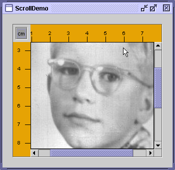
The examples that come with the accessibility utilities can give you an idea of how accessible your program is. For instructions on getting these utilities, see the Accessibility home pageLet's use an accessibility utility to compare the original version of one of our demos to a version in which the rules for supporting accessibility have been applied. Here's a picture of a program called
ScrollDemo.
Try this:
- Run ScrollDemo using JavaTM Web Start
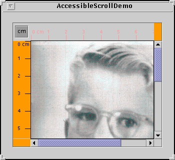
- Next, run AccessibleScrollDemo using Java Web Start. Or, to compile and run the example yourself, consult the example index.
- Compare the two versions side by side. The only noticeable difference is that the cm toggle button and the photograph have tool tips in the accessible version.
- Now run the two versions under the accessibility utility called Monkey. Note that when the accessibility tools have been downloaded and configured in the
accessibility.propertiesfile, the Monkey window automatically comes up when you click on the Run ScrollDemo and AccessibleScrollDemo links (in steps 1 and 2).If the Monkey window does not appear on startup, the problem may be that the
accessibility.propertiesfile is not present in the version of the VM being used by Java Web Start. You can change the VM you use by running the Java Web Start Application Manager and selecting File > Preferences > Java.
- Note that when the Monkey window comes up you need to select File > Refresh Trees to see information appear under
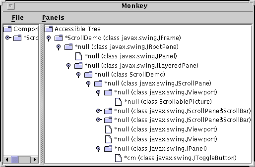
Accessible Tree. You can then expand the tree by successively clicking on the horizontal icons displayed by each folder icon. When the tree has been expanded, you can see detailed information for the various components. The custom components (rules and corners) that weren't accessible in the original version are accessible in the modified version. This can make quite a difference to assistive technologies.Here's a snapshot of Monkey running on
ScrollDemo:[PENDING: recapture the output.]
The left side of the split pane shows the actual component hierarchy for the program. The right side shows the accessible components in the hierarchy, which is what interests us.
The first thing to notice is that, even with no explicit support in
ScrollDemo, Monkey is able to discover a lot of information about the various components in the program. Most of the components and their children appear in the tree. However, the names for most of the components are empty (null), which is rather unhelpful. The descriptions are also empty.Further trouble comes with the program's custom components. The two rulers are inaccessible, so they are not included in the accessible tree. The viewports that contain the rulers are displayed as leaf nodes because they have no accessible children. The custom corners are also missing from the accessible tree.
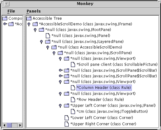
Now here's a picture of the Monkey window for
AccessibleScrollDemo:[PENDING: recapture the output.]
The rules are now listed as children of the viewports, and the corners are listed as children of the scroll pane. Furthermore, many of the components now have non-null names.In the previous snapshot of Monkey, the Column Header item is selected. Monkey highlights the corresponding component in
ScrollDemoprogram.[PENDING: new screenshot needed]
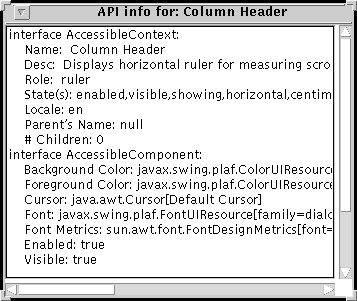
When an item is selected, you can use Monkey's Panels menu to bring up one of four different panels that let you interact with the selected component. Choosing Panels > Accessibility API panel brings up a panel like the one shown in the following figure. This panel displays information available through methods defined in theAccessibleContextbase class and theAccessibleComponentinterface.Monkey has three other panels: The accessibility utilities examples are handy as testing tools and can give you an idea of how accessible the components in your program are. However, even if your components behave well in Monkey or the other examples, they still might not be completely accessible because Monkey and the other examples exercise only certain portions of the Accessibility API. The only true test of accessibility is to run your programs with real-world assistive technologies.
- AccessibleAction— Shows the actions supported by an accessible component and lets you invoke the action. Works only with an accessible component whose context implements the
AccessibleActioninterface.- AccessibleSelection— Shows the current selection of an accessible component and lets you manipulate the selection. Works only with accessible component whose context implements the
AccessibleSelectioninterface.- AccessibleHypertext— Shows any hyperlinks contained within an accessible component and lets you traverse them. Works only with accessible component whose context implements the
AccessibleHypertextinterface.Setting Accessible Names and Descriptions on Components
Giving your program's components accessible names and descriptions is one of the easiest and most important steps in making your program accessible. Following is a complete listing of theAccessibleScrollDemoconstructor that creates the scroll pane and the custom components it uses. The boldface statements give components names and descriptions that assistive technologies can use.Often, the program sets a component's name and description directly through the component's accessible context. Other times, the program sets an accessible description indirectly with tool tips. In the case of the cm toggle button, the description is set automatically to the text on the button.public AccessibleScrollDemo() { // Get the image to use. ImageIcon david = createImageIcon("images/youngdad.jpeg", "Photograph of David McNabb in his youth."); // Create the row and column headers. columnView = new Rule(Rule.HORIZONTAL, true); if (david != null) { columnView.setPreferredWidth(david.getIconWidth()); } else { columnView.setPreferredWidth(320); } columnView.getAccessibleContext().setAccessibleName("Column Header"); columnView.getAccessibleContext(). setAccessibleDescription("Displays horizontal ruler for " + "measuring scroll pane client."); rowView = new Rule(Rule.VERTICAL, true); if (david != null) { rowView.setPreferredHeight(david.getIconHeight()); } else { rowView.setPreferredHeight(480); } rowView.getAccessibleContext().setAccessibleName("Row Header"); rowView.getAccessibleContext(). setAccessibleDescription("Displays vertical ruler for " + "measuring scroll pane client."); // Create the corners. JPanel buttonCorner = new JPanel(); isMetric = new JToggleButton("cm", true); isMetric.setFont(new Font("SansSerif", Font.PLAIN, 11)); isMetric.setMargin(new Insets(2,2,2,2)); isMetric.addItemListener(this); isMetric.setToolTipText("Toggles rulers' unit of measure " + "between inches and centimeters."); buttonCorner.add(isMetric); //Use the default FlowLayout buttonCorner.getAccessibleContext(). setAccessibleName("Upper Left Corner"); String desc = "Fills the corner of a scroll pane " + "with color for aesthetic reasons."; Corner lowerLeft = new Corner(); lowerLeft.getAccessibleContext(). setAccessibleName("Lower Left Corner"); lowerLeft.getAccessibleContext().setAccessibleDescription(desc); Corner upperRight = new Corner(); upperRight.getAccessibleContext(). setAccessibleName("Upper Right Corner"); upperRight.getAccessibleContext().setAccessibleDescription(desc); // Set up the scroll pane. picture = new ScrollablePicture(david, columnView.getIncrement()); picture.setToolTipText(david.getDescription()); picture.getAccessibleContext().setAccessibleName( "Scroll pane client"); JScrollPane pictureScrollPane = new JScrollPane(picture); pictureScrollPane.setPreferredSize(new Dimension(300, 250)); pictureScrollPane.setViewportBorder( BorderFactory.createLineBorder(Color.black)); pictureScrollPane.setColumnHeaderView(columnView); pictureScrollPane.setRowHeaderView(rowView); // In theory, to support internationalization you would change // UPPER_LEFT_CORNER to UPPER_LEADING_CORNER, // LOWER_LEFT_CORNER to LOWER_LEADING_CORNER, and // UPPER_RIGHT_CORNER to UPPER_TRAILING_CORNER. In practice, // bug #4467063 makes that impossible (at least in 1.4.0). pictureScrollPane.setCorner(JScrollPane.UPPER_LEFT_CORNER, buttonCorner); pictureScrollPane.setCorner(JScrollPane.LOWER_LEFT_CORNER, lowerLeft); pictureScrollPane.setCorner(JScrollPane.UPPER_RIGHT_CORNER, upperRight); // Put it in this panel. setLayout(new BoxLayout(this, BoxLayout.X_AXIS)); add(pictureScrollPane); setBorder(BorderFactory.createEmptyBorder(20,20,20,20)); }Concepts: How Accessibility Works
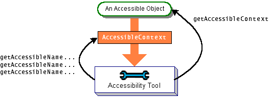
An object is accessible if it implements theAccessibleAccessibleinterface defines just one method,getAccessibleContext, which returns anAccessibleContextAccessibleContextobject is an intermediary that contains the accessible information for an accessible object. The following figure shows how assistive technologies get the accessible context from an accessible object and query it for information:
AccessibleContextis an abstract class that defines the minimum set of information an accessible object must provide about itself. The minimum set includes name, description, role, state set, and so on. To identify its accessible object as having particular capabilities, an accessible context can implement one or more of the interfaces as shown in the Accessible Interfaces table. For example,JButtonimplementsAccessibleAction,AccessibleValue,AccessibleText, andAccessibleExtendedComponent. It is not necessary forJButtonto implementAccessibleIconbecause that is implemented by theImageIconattached to the button.Because the
JComponentclass itself does not implement theAccessibleinterface, instances of its direct subclasses are not accessible. If you write a custom component that inherits directly fromJComponent, you need to explicitly make it implement theAccessibleinterface.JComponentdoes have an accessible context, calledAccessibleJComponent, that implements theAccessibleComponentinterface and provides a minimal amount of accessible information. You can provide an accessible context for your custom components by creating a subclass ofAccessibleJComponentand overriding important methods. Making Custom Components Accessible shows two examples of doing this.All the other standard Swing components implement the
Accessibleinterface and have an accessible context that implements one or more of the preceding interfaces as appropriate. The accessible contexts for Swing components are implemented as inner classes and have names of this style:If you create a subclass of a standard Swing component and your subclass is substantially different from its superclass, then you should provide a custom accessible context for it. The easiest way is to create a subclass of the superclass's accessible context class and override methods as necessary. For example, if you create aComponent.AccessibleComponentJLabelsubclass substantially different fromJLabel, then yourJLabelsubclass should contain an inner class that extendsAccessibleJLabel. The next section shows how to do so, using examples in whichJComponentsubclasses extendAccessibleJComponent.Making Custom Components Accessible
The scroll demo program uses three custom component classes.ScrollablePictureis a subclass ofJLabel, andCornerandRuleare both subclasses ofJComponent.The
ScrollablePictureclass relies completely on accessibility inherited fromJLabelthroughJLabel.AccessibleJLabelScrollablePicturesets the tool-tip text for the scrollable picture. The tool-tip text is used by the context as the component's accessible description. This behavior is provided byAccessibleJLabel.The accessible version of the
Cornerclass contains just enough code to make its instances accessible. We implemented accessibility support by adding the code shown in bold to the original version ofCorner.All of the accessibility provided by this class is inherited frompublic class Corner extends JComponent implements Accessible { protected void paintComponent(Graphics g) { //Fill me with dirty brown/orange. g.setColor(new Color(230, 163, 4)); g.fillRect(0, 0, getWidth(), getHeight()); } public AccessibleContext getAccessibleContext() { if (accessibleContext == null) { accessibleContext = new AccessibleCorner(); } return accessibleContext; } protected class AccessibleCorner extends AccessibleJComponent { //Inherit everything, override nothing. } }AccessibleJComponentCornerbecauseAccessibleJComponentprovides a reasonable amount of default accessibility information and because corners are uninteresting— they exist only to take up a little bit of space onscreen. Other classes, such asRule, need to provide customized information.
Ruleprovides an accessible context for itself in the same manner asCorner, but the context overrides two methods to provide details about the component's role and state:protected class AccessibleRuler extends AccessibleJComponent { public AccessibleRole getAccessibleRole() { return AccessibleRuleRole.RULER; } public AccessibleStateSet getAccessibleStateSet() { AccessibleStateSet states = super.getAccessibleStateSet(); if (orientation == VERTICAL) { states.add(AccessibleState.VERTICAL); } else { states.add(AccessibleState.HORIZONTAL); } if (isMetric) { states.add(AccessibleRulerState.CENTIMETERS); } else { states.add(AccessibleRulerState.INCHES); } return states; } }AccessibleRoleAccessibleRole:Any component that has state can provide state information to assistive technologies by overriding theclass AccessibleRuleRole extends AccessibleRole { public static final AccessibleRuleRole RULER = new AccessibleRuleRole("ruler"); protected AccessibleRuleRole(String key) { super(key); } //Should really provide localizable versions of these names. public String toDisplayString(String resourceBundleName, Locale locale) { return key; } }getAccessibleStateSetmethod. A rule has two sets of states: its orientation can be either vertical or horizontal, and its units of measure can be either centimeters or inches.AccessibleStateAccessibleStatecontains nothing for centimeters and inches, the program makes a subclass to provide appropriate states:You've seen how to implement accessibility for two simple components, that exist only to paint themselves onscreen. Components that do more, such as responding to mouse or keyboard events, need to provide more elaborate accessible contexts. You can find examples of implementing accessible contexts by delving in the source code for the Swing components.class AccessibleRulerState extends AccessibleState { public static final AccessibleRulerState INCHES = new AccessibleRulerState("inches"); public static final AccessibleRulerState CENTIMETERS = new AccessibleRulerState("centimeters"); protected AccessibleRulerState(String key) { super(key); } //Should really provide localizable versions of these names. public String toDisplayString(String resourceBundleName, Locale locale) { return key; } }The Accessibility API
The tables in this section cover just part of the accessibility API. For more information about the accessibility API, see the API documentation for the classes and packages in the accessibility packageThe API for supporting accessibility falls into the following categories:
Naming and Linking Components Method Purpose getAccessibleContext().setAccessibleName(String)
getAccessibleContext().setAccessibleDescription(String)
(on aJComponentorAccessibleobject)Provide a name or description for an accessible object. void setToolTipText(String)
(inJComponent)Set a component's tool tip. If you don't set the description, than many accessible contexts use the tool-tip text as the accessible description. void setLabelFor(Component)
(inJLabel)Associate a label with a component. This tells assistive technologies that a label describes another component. void setDescription(String)
(inImageIcon)Provide a description for an image icon.
Making a Custom Component Accessible Interface or Class Purpose Accessible
(an interface)Components that implement this interface are accessible. Subclasses of JComponentmust implement this explicitly.AccessibleContext
JComponent.AccessibleJComponent
(an abstract class and its subclasses)AccessibleContextdefines the minimal set of information required of accessible objects. The accessible context for each Swing component is a subclass of this and named as shown. For example, the accessible context forJTreeisJTree.AccessibleJTree. To provide custom accessible contexts, custom components should contain an inner class that is a subclass ofAccessibleContext. For more information, see Making Custom Components Accessible.AccessibleRole
AccessibleStateSet
(classes)Define the objects returned by an AccessibleContextobject'sgetAccessibleRoleandgetAccessibleStateSetmethods, respectively.AccessibleRelation
AccessibleRelationSet
(classes introduced in 1.3)Define the relations between components that implement this interface and one or more other objects.
Accessible Interfaces Interface Purpose AccessibleActionIndicates that the object can perform actions. By implementing this interface, the accessible context can give information about what actions the accessible object can perform and can tell the accessible object to perform them. AccessibleComponentIndicates that the accessible object has an onscreen presence. Through this interface, an accessible object can provide information about its size, position, visibility and so on. The accessible contexts for all standard Swing components implement this interface, directly or indirectly. The accessible contexts for your custom components should do the same. As of 1.4, AccessibleExtendedComponentis preferred.AccessibleEditableText
(Introduced in 1.4)Indicates that the accessible object displays editable text. In addition to the information available from its superinterface, AccessibleText, methods are provided for cutting, pasting, deleting, selecting, and inserting text.AccessibleExtendedComponent
(Introduced in 1.4)In addition to the information available from its superinterface, AccessibleComponent, methods are provided for obtaining key bindings, border text, and tool-tip text.AccessibleExtendedTable
(Introduced in 1.4)In addition to the information available from its superinterface, AccessibleTable, methods are provided to convert between an index and its row or column.AccessibleHypertextIndicates that the accessible object contains hyperlinks. Through this interface, an accessible object can provide information about its links and allow them to be traversed. AccessibleIcon
(Introduced in 1.3)Indicates that the accessible object has an associated icon. Methods are provided that return information about the icon, such as size and description. AccessibleKeyBinding
(Introduced in 1.4)Indicates that the accessible object supports one or more keyboard shortcuts that can be used to select the object. Methods are provided that return the key bindings for a given object. AccessibleSelectionIndicates that the accessible object can contain a selection. Accessible contexts that implement this interface can report information about the current selection and can modify the selection. AccessibleTable
(Introduced in 1.3)Indicates that the accessible object presents data in a two-dimensional data object. Through this interface information about the table such as table caption, row and column size, description, and name are provided. As of 1.4, AccessibleExtendedTableis preferred.AccessibleTextIndicates that the accessible object displays text. This interface provides methods for returning all or part of the text, attributes applied to it, and other information about the text such as its length. AccessibleValueIndicates that the object has a numeric value. Through this interface an accessible object provides information about its current value and its minimum and maximum values. Examples that Use the Accessibility API
The following table lists some of our examples that have good support for assistive technologies.
Example Where Described Notes AccessibleScrollDemoThis section Contains two custom components that implement the Accessibleinterface. To see a less accessible version of this program see How to Use Scroll Panes.ButtonDemoHow to Use the Common Button API Uses three buttons. Supports accessibility through button text, mnemonics, and tool tips.
Start of Tutorial > Start of Trail > Start of Lesson Search
Feedback FormCopyright 1995-2005 Sun Microsystems, Inc. All rights reserved.